As far as the customer is concerned, the Interface is the product.
-Jef Raskin
Our payroll application is coming together nicely at this point. It supports adding hourly, salary, and commissioned employees. Each employee's payments may be delivered by mail, direct deposit, or held in the office. The system can calculate the pay for each employee and have it delivered on a variety of schedules. Furthermore, all the data created and used by the system is persisted in a relational database.
In its current state, the system supports all the needs of our customer. In fact, it was put into production last week. It was installed on a computer in the Human Resources department, and Joe was trained to use it. Joe receives companywide requests to add new employees or change existing employees. He enters each request by adding the appropriate transaction text to a text file that is processed every night. Joe has been very grumpy recently, but he became very happy when he heard that we're going to build a user interface for the payroll system. This UI should make the payroll system easier to use. Joe is happy about this because everyone will be able to enter his or her own transactions instead of sending them to Joe to type into the transaction file.
Deciding what type of interface to build required a long discussion with the customer. One option proposed was a text-based interface whereby users would traverse menus, using keystrokes and entering data via the keyboard. Although text interfaces are easy to build, they can be less than easy to use. Besides, most users today consider them to be “clunky.”
A Web interface was also considered. Web applications are great because they don't usually require any installation on the user's machines and can be used from any computer connected to the office intranet. But building Web interfaces is complicated because they appear to tie the application to a large and complex infrastructure of Web servers, application servers, and tiered architectures.[1] This infrastructure needs to be purchased, installed, configured, and administered. Web systems also tie us to such technologies as HTML, CSS, and JavaScript and force us into a somewhat stilted user model reminiscent of the 3270 green-screen applications of the 1970s.
Our users, and our company, wanted something simple to use, build, install, and administer. So in the end, we opted for a GUI desktop application. GUI desktop applications provide a more powerful set of UI functionality and can be less complicated to build than a Web interface. Our initial implementation won't be deployed over a network, so we won't need any of the complex infrastructure that Web systems seem to require.
Of course, desktop GUI applications have some disadvantages. They are not portable and are not easily distributed. However, since all the users of the payroll system work in the same office and use company computers, it was agreed that these disadvantages don't cost us as much as the Web architecture would. So we decided to use Windows Forms to build our UI.
Since UIs can be tricky, we'll limit our first release to adding employees. This first small release will give us some valuable feedback. First, we'll find out how complicated the UI is to build. Second, Joe will use the new UI and will tell us how much easier life is-we hope. Armed with this information, we will know better how to proceed to build the rest of the UI. It is also possible that the feedback from this first small release might suggest that a text-based or Web interface would be better. If that happens, it would be better to know before we invested effort in the whole application.
The form of the UI is less important than the internal architecture. Whether desktop or Web, UIs are usually volatile and tend to change more often than the business rules beneath them. Thus, it will behoove us to carefully separate the business logic from the user interface. Toward that end, we'll write as little code in the Windows Forms as possible. Instead, we'll put the code in plain C# classes that will work together with the Windows Forms. This separation strategy protects the business rules from the volatility of the UI. Changes to the UI code won't affect the business rules. Moreover, if one day we decide to switch to a Web interface, the business rule code will already have been separated.
The Interface
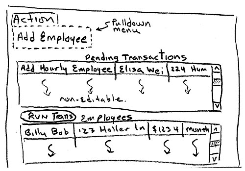
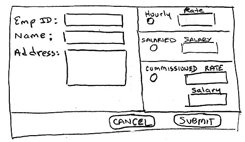
Figure 38- 1 shows the general idea for the UI that we'll build. The menu named Action contains a list of all the supported actions. Selecting an action opens an appropriate form for creating the selected action. For example, Figure 38-****2 shows the form that appears when Add Employee is selected. For the time being, Add Employee is the only action we're interested in.


Near the top of the Payroll window is a text box labeled Pending Transactions. Payroll is a batch system. Transactions are entered throughout the day but are not executed until night, when they are all executed together as a batch. This top text box is a list of all the pending transaction that have been collected but not yet executed. In Figure 38-****1 we can see that there is one pending transaction to add an hourly employee. The format of this list is readable, but we'll probably want to make it look prettier down the road. For now, this should do.
The bottom text box is labeled Employees and contains a list of employees who already exist in the system. Executing AddEmployeeTransactions will add more employees to this list. Again, we can imagine a much better way to display the employees. A tabular format would be nice. There could be a column for each bit a data, along with a column for the date of the last paycheck, amount paid to date, and so on. Records for hourly and commissioned employees would include a link to a new window that would list their time cards and sales receipts, respectively. That will have to wait, though.
In the middle is a button labeled Run Transactions, which does just as it suggests. Clicking it will invoke the batch, executing all the pending transactions and updating the employee list. Unfortunately, someone will have to click this button to initiate the batch. This is a temporary solution until we create an automatic schedule to do it.
Implementation
We can't get very far with the payroll window without being able to add transactions, so we'll start with the form to add an employee transaction, shown in Figure 38-****2. Let's think about the business rules that have to be achieved through this window. We need to collect all the information to create a transaction. This can be achieved as the user fills out the form. Based on the information, we need to figure out what type of AddEmployeeTransaction to create and then put that transaction in the list to be processed later. This will all be triggered by a click of the Submit button.
That about covers it for the business rules, but we need other behaviors to make the UI more usable. The Submit button, for example, should remain disabled until all the required information is supplied. Also, the text box for hourly rate should be disabled unless the Hourly radio button is on. Likewise, the Salary, Base Salary, and Commission text boxes should remain disabled until the appropriate radio button is clicked.
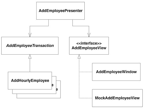
We must be careful to separate the business behavior from the UI behavior. To do so, we'll use the Model View Presenter design pattern. Figure 38-****3 shows a UML design for how we'll use Model View Presenter for our current task. You can see that the design has three components: the model, the view, and the presenter. The model in this case represents the AddEmployeeTransaction class and its derivatives. The view is a Windows Form called AddEmployeeWindow, shown in Figure 38-****2. The presenter, a class called AddEmployeePresenter, glues the UI to the model. AddEmployeePresenter contains all the business logic for this particular part of the application, whereas AddEmployeeWindow contains none. Instead, AddEmployeeWindow confines itself to the UI behavior, delegating all the business decisions to the presenter.

An alternative to using Model View Presenter is to push all the business logic into the Windows Form. In fact, this approach is very common but quite problematic. When the business rules are embedded in the UI code, not only do you have an SRP violation, but also the business rules are much more difficult to automatically test. Such tests would have to involve clicking buttons, reading labels, selecting items in a combo box, and fidgeting with other types of controls. In other words, in order to test the business rules, we'd have to actually use the UI. Tests that use the UI are fragile because minor changes to the UI controls have a large impact on the tests. They're also tricky because getting UIs in a test harness is a challenge in and of itself. Also, later down the road, we may decide that a Web interface is needed, and business logic embedded in the Windows form code would have to be duplicated in the ASP.NET code.
The observant reader will have noticed that the AddEmployeePresenter does not directly depend on the AddEmployeeWindow. The AddEmployeeView interface inverts the dependency. Why? Most simply, to make testing easier. Getting user interfaces under test is challenging. If AddEmployeePresenter was directly dependent upon AddEmployeeWindow, AddEmployeePresenterTest would also have to depend on AddEmployeeWindow, and that would be unfortunate. Using the interface and MockAddEmployeeView greatly simplifies testing.
Listing 38-1 and Listing 38-2 show the AddEmployeePresenterTest and AddEmployeePresenter, respectively. This is where the story begins.
Starting with the SetUp method of the test, we see what's involved in instantiating the AddEmployeePresenter. It takes three parameters. The first is an AddEmployeeView, for which we use a MockAddEmployeeView in the test. The second is a TransactionContainer so that it has a place to put the AddEmployeeTransaction that it will create. The last parameter is a PayrollDatabase instance that won't be used directly but is needed as a parameter to the AddEmployeeTransaction constructors.
The first test, Creation, is almost embarrassingly silly. When first sitting down to write code, it can be difficult to figure out what to test first. It often helps to test the simplest thing you can think of. Doing so gets the ball rolling, and subsequent tests come much more naturally. The Creation test is an artifact of this practice. It makes sure that the container parameter was saved, and it could probably be deleted at this point.
The next test, AllInfoIsCollected, is much more interesting. One of the responsibilities of the AddEmployeePresenter is to collect all the information required to create a transaction. Partial data won't do, so the presenter has to know when all the necessary data has been collected. This test says that the presenter needs a methods called AllInformationIsCollected, that returns a boolean value. The test also demonstrates how the presenter's data is entered through properties. Each piece of data is entered here one by one. At each step, the presenter is asked whether it has all the data it needs and asserts the expected response. In AddEmployeePresenter, we can see that each property simply stores the value in a field. AllInformationIsCollected does a bit of Boolean algebra as it checks that each field has been provided.
When the presenter has all the information it needs, the user may submit the data adding the transaction. But not until the presenter is content with the data provided should the user be able to submit the form. So it is the presenter's responsibility to inform the user when the form can be submitted. This is tested by the method ViewGetsUpdated. This test provides data, one piece at a time to the presenter. Each time, the test checks to make sure that the presenter properly informs the view whether submission should be enabled.
Looking in the presenter, we can see that each property makes a call to UpdateView, which in turn calls the SaveEnabled property on the view. Listing 38-3 shows the AddEmployeeView interface with SubmitEnabled declared. AddEmployeePresenter informs that submitting should be enabled by calling the SubmitEnabled property. Now we don't particularly care what SubmitEnabled does at this point. We simply want to make sure that it is called with the right value. This is where the AddEmployeeView interface comes in handy. It allows us to create a mock view to make testing easier. In MockAddEmployeeView, shown in Listing 38-4, there are two fields: submitEnabled, which records the last values passed in, and submitEnabledCount, which keeps track of how many times SubmitEnabled is invoked. These trivial fields make the test a breeze to write. All the test has to do is check the submitEnabled field to make sure that the presenter called the SubmitEnabled property with the right value and check submitEnabledCount to make sure that it was invoked the correct number of times. Imagine how awkward the test would have been if we had to dig into forms and window controls.
Something interesting happened in this test. We were careful to test how AddEmployeePresenter behaves when data is entered into the view rather than testing what happens when data is entered. In production, when all the data is entered, the Submit button will become enabled. We could have tested that; instead, we tested how the presenter behaves. We tested that when all the data is entered, the presenter will send a message to the view, telling it to enable submission.
This style of testing is called behavior-driven development. The idea is that you should not think of tests as tests, where you make assertions about state and results. Instead, you should think of tests as specifications of behavior, in which you describe how the code is supposed to behave.
The next test, CreatingTransaction, demonstrates that AddEmployeePresenter creates the proper transaction, based on the data provided. AddEmployeePresenter uses an if/else statement, based on the payment type, to figure out which type of transaction to create.
That leaves one more test, AddEmployee. When the all the data is collected and the transaction is created, the presenter must save the transaction in the TransactionContainer so that it can be used later. This test makes sure that this happens.
With AddEmployeePresenter implemented, we have all the business rules in place to create AddEmployeeTransactions. Now all we need is user interface.
Building a Window
Designing the Add Employee window GUI code was a breeze. With Visual Studio's designer, it's simply a matter of dragging some controls around to the right place. This code is generated for us and is not included in the following listings. Once the window is designed, we have more work to do. We need to implement some behavior in the UI and wire it to the presenter. We also need a test for it all. Listing 38-5 shows AddEmployeeWindowTest, and Listing 38-6 shows AddEmployeeWindow.
Despite all my griping about how painful it is to test GUI code, testing Windows Form code is relatively easy. There are some pitfalls, however. For some silly reason, known only to programmers at Microsoft, half of the functionality of the controls does not work unless they are displayed on the screen. It is for this reason that you'll find the call window.Show() in the SetUp of the test fixture. When the tests are executed, you can see the window appearing and quickly disappearing for each test. This is annoying but bearable. Anything that slows down the tests or otherwise makes them clumsy makes it more likely that the tests will not be run.
Another limitation is that you cannot easily invoke all the events on a control. With buttons and buttonlike controls, you can call PerformClick, but events such as MouseOver, Leave, Validate, and others are not so easy. An extension for NUnit, called NUnitForms, can help with these problems and more. Our tests are simple enough to get by without extra help.
In the SetUp of our test, we create an instance of AddEmployeeWindow and give it an instance of AddEmployeePresenter. Then in the first test, StartingState, we make sure that several controls are disabled: hourlyRateTextBox, salaryTextBox, commissionSalaryTextBox, and commissionTextBox. Only one or two of these fields are needed, and we don't know which ones until the user chooses the payment type. To avoid confusing the user by leaving all the fields enabled, they'll remain disabled until needed. The rules for enabling these controls are specified in three tests: EnablingHourlyFields, EnablingSalaryField, and EnablingCommissionFields. EnablingHourlyFields, for example, demonstrates how the hourlyRateTextBox is enabled when the hourlyRadioButton is turned on and disabled when the radio button is turned off. This is achieved by registering an EventHandler with each RadioButton. Each EventHandler enables and disables the appropriate text boxes.
The test, PresenterValuesAreSet, is an important one. The presenter know what to do with the data, but it's the view's responsibility to populate the data. Therefore, whenever a field in the view is changed, it calls the corresponding property on the presenter. For each TextBox in the form, we use the Text property to change the value and then check to make sure that the presenter is properly updated. In AddEmployeeWindow, each TextBox has an EventHandler registered on the TextChanged event. For the RadioButton controls, we call the PerformClick method in the test and again make sure that the presenter is informed. The RadioButton's EventHandlers take care of this.
EnablingAddEmployeeButton specifies how the submitButton is enabled when the SubmitEnabled property is set to true, and reverse. Remember that in AddEmployeePresenterTest, we didn't care what this property did. Now we do care. The view must respond properly when the SubmitEnabled property is changed; however, AddEmployeePresenterTest was not the right place to test it. AddEmployeeWindowTest focuses on the behavior of the AddEmployeeWindow, and it is the right place to test this unit of code.
The final test here is AddEmployee, which fills in a valid set of fields, clicks the Submit button, asserts that the window is no longer visible, and makes sure that a transaction was added to the transactionContainer. To make this pass, we register an EventHandler, on the submitButton, that calls AddEmployee on the presenter and then closes the window. If you think about it, the test is doing a lot of work just to make sure that the AddEmployee method was called. It has to populate all the fields and then check the transactionContainer. Some might argue that instead, we should use a mock presenter so we can easily check that the method was called. To be honest, I wouldn't put up a fight if my pair partner were to bring it up. But the current implementation doesn't bother me too much. It's healthy to include a few high-level tests like this. They help to make sure that the pieces can be integrated properly and that the system works the way it should when put together. Normally, we'd have a suite of acceptance tests that do this at an even higher level, but it doesn't hurt to do it a bit in the unit tests-just a bit, though.
With this code in place, we now have a working form for creating AddEmployeeTransactions. But it won't get used until we have the main Payroll window working and wired up to load our AddEmployeeWindow.
The Payroll Window
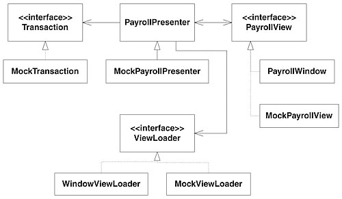
In building the Payroll view, shown in Figure 38-4, we'll use the same Model View Presenter pattern used in the Add Employee view.

Listings 38-7 and 38-8 show all the code in this part of the design. Altogether, the development of this view is very similar to that of the Add Employee view. For that reason, we will not pay it much attention. Of particular note, however, is the ViewLoader hierarchy.
Sooner or later in developing this window, we'll get around to implementing an EventHandler for the Add Employee MenuItem. This EventHandler will call the AddEmployeeActionInvoked method on PayrollPresenter. At this point, the AddEmployeeWindow needs to pop up. Is PayrollPresenter supposed to instantiate AddEmployeeWindow? So far, we have done well to decouple the UI from the application. Were it to instantiate the AddEmployeeWindow, PayrollPresenter would be violating DIP. Yet someone must create AddEmployeeWindow.
Factory pattern to the rescue! This is the exact problem that Factory was designed to solve. ViewLoader, and its derivatives, are in fact an implementation of the Factory pattern. It declares two methods: LoadPayrollView and LoadAddEmployeeView. WindowsViewLoader implements these methods to create Windows Forms and display them. The MockViewLoader, which can easily replace the WindowsViewLoader, makes testing much easier.
With the ViewLoader in place, PayrollPresenter need not depend on any Windows form classes. It simply makes a call to the LoadAddEmployeeView on its reference to ViewLoader. If the need ever arises, we can change the whole user interface for Payroll by swapping the ViewLoader implementation. No code needs to change. That's power! That's OCP!
The Unveiling
A lot of work has gone into this payroll application, and at last we'll see it come alive with its new graphical user interface. Listing 38-19 contains the PayrollMain class, the entry point for the application. Before we can load the Payroll view, we need an instance of the database. In this code listing, an InMemoryPayrollDatabase is being created. This is for demonstration purposes. In production, we'd create an SqlPayrollDatabase that would link up to our SQL Server database. But the application will happily run with the InMemoryPayrollDatabase while all the data is saved in memory and loaded in memory.
Next, an instance of WindowViewLoader is created. LoadPayrollView is called, and the application is started. We can now compile, run it, and add as many employees to the system as we like.
Conclusion
Joe will be happy to see what we've done for him. We'll build a production release and let him try it out. Surely he'll have comments about how the user interface is crude and unpolished. There will be quirks that slow him down or aspects that he finds confusing. User interfaces are difficult to get right. So we'll pay close attention to his feedback and go back for another round. Next, we'll add actions to change employee details. Then we'll add actions to submit time cards and sales receipts. Finally we'll handle payday. This is all left to you, of course.
Bibliography
http://daveastels.com/index.php?p=5
http://www.martinfowler.com/eaaDev/ModelViewPresenter.html
http://nunitforms.sourceforge.net/
http://www.objectmentor.com/resources/articles/TheHumbleDialogBox.pdf
[1]Or so it seems to the unwary software architect. In many unfortunate cases, this extra infrastructure provides much more benefit to the vendors than to the users.
© Copyright Pearson Education. All rights reserved.


